It is extremely hard to know exactly what colour you are getting out of a paint bottle from a specific paint range. The colours you see on the box, on the paint label and even the paint in the bottle is not the same as what it will look on the mini. A host of different factors influence how it looks (light, thickness of coat, opacity and what colour is underneath and the list goes on).
This is only worse with Contrast Paints from Citadel, Speedpaint from Army Painter and all the other “one coat” paints out there.
I have always wanted to make a tool where people (and myself) could more easily see exactly what colour the specific colour from a paint range will look like once it is applied. It would also be amazing if it was easy to compare to paints from other ranges. This is very much inspired by my articel about the Citadel Texture Paints. In essence, the Army Painter Speedpaint images on different primers.
This is one of those projects that I have wanted to do for such a long time, but have gotten scope creeped hard over time. I woke up this morning realizing that I might never get this to a stage where I like it, but that shipped is better than perfect. So instead of making an expensive app with this (which would be sweet), I am just going to put this out there for people to use. If I do not do it now, it might never get out there.
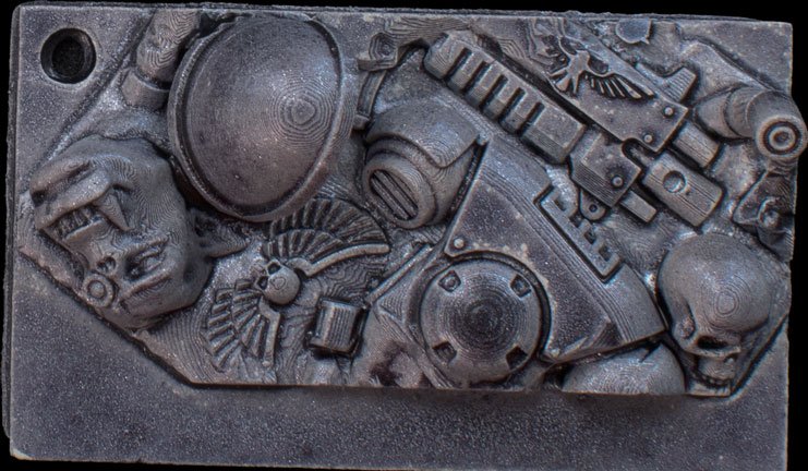
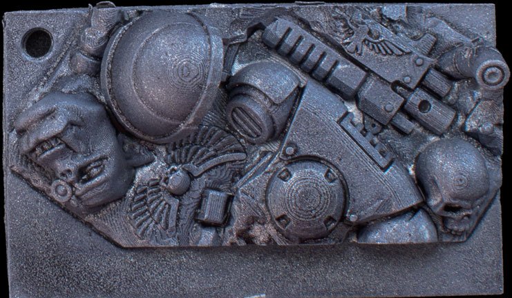
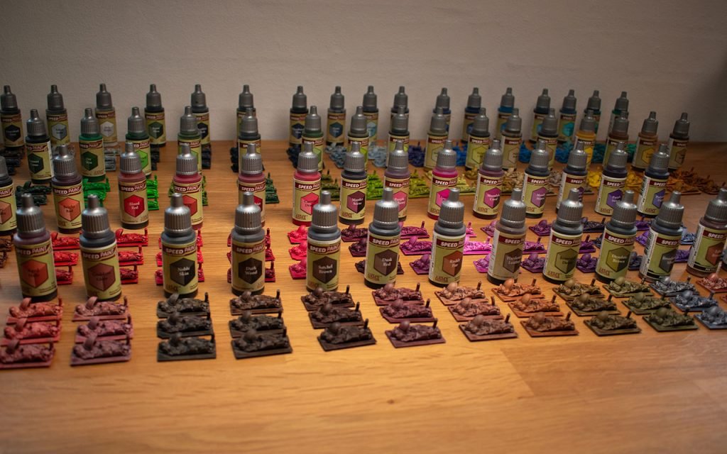
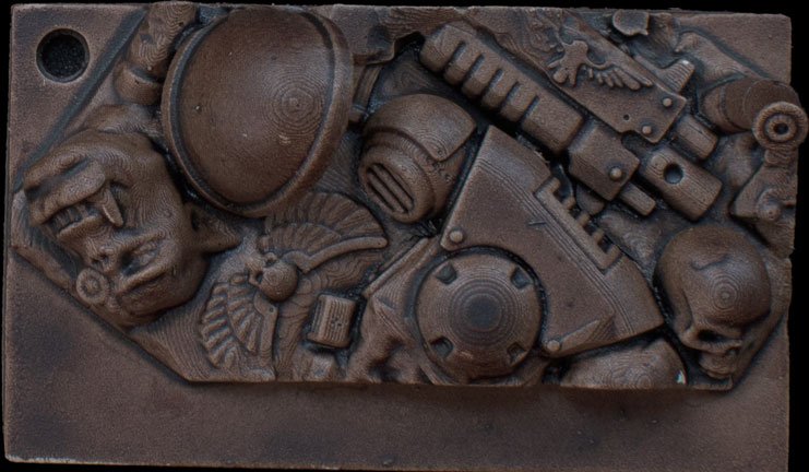
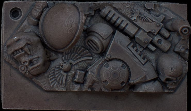
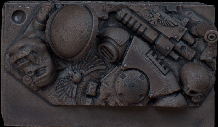
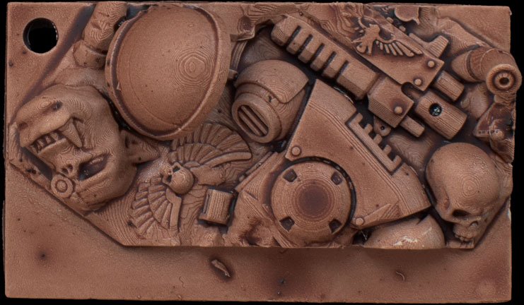
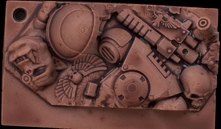
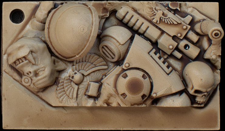
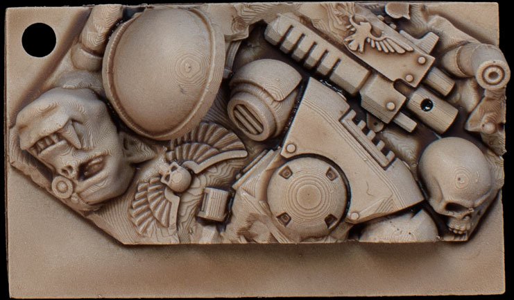
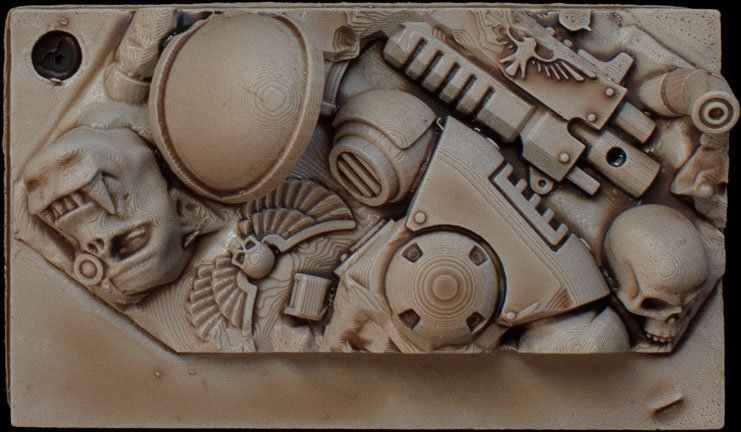
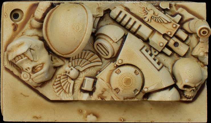
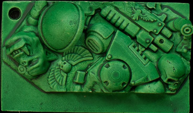
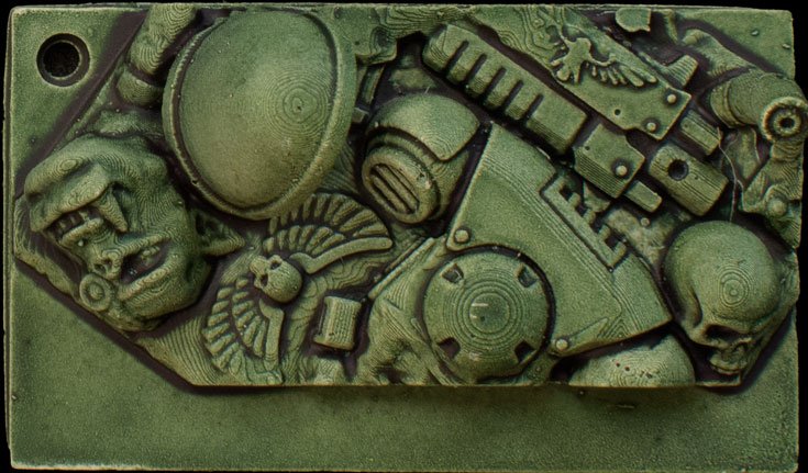
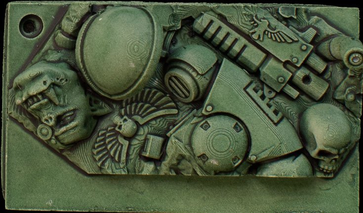
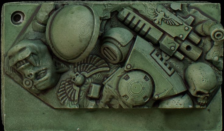
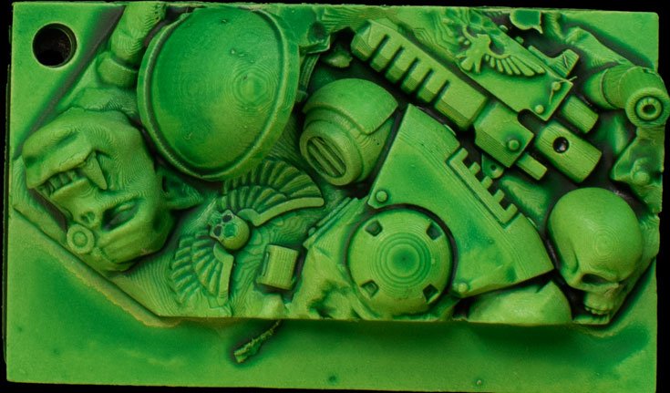
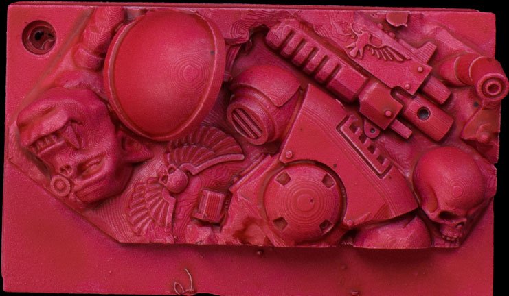
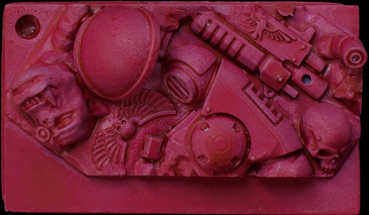
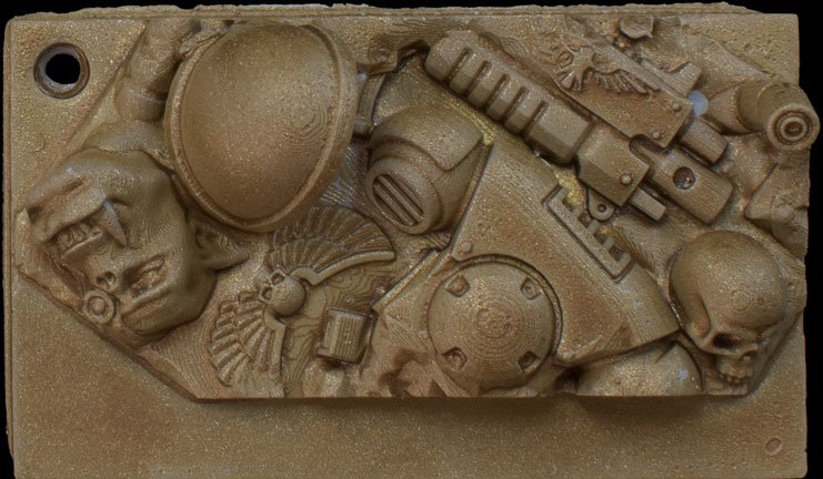
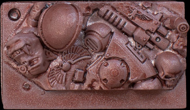
So this article will simply be images of the colours from the Army Painter Speedpaint range, applied to to the same 3D printed “paint sample” thing. The point is that you can compare the colours to each other and you can compare the same colour when applied to either a primer of beige, white or grey.
I hope it can be useful to you.
The images are sorted according to this overview of the full Army Painter Speedpaint 2.0 Range (which is the best sorting I have found):

Underneath the headline of each colour I have written the description Army Painter has for each paint in the chart above
Right now I only have the paints from the Mega Set 2.0, so I am missing a few colurs, the pastel and a lot of the metal colours.
Taking images of a colour and representing what it looks like on a screen is surprisingly difficult. I have tried my best to represent how the colors look like when I look at them underneath a painting lamp with the best daylight you can find.
But things might differ a bit. These are the factors at play when editing images like this:
- The light they are taken under
- The reflection of the specific paint
- The camera and the lens
- How accurately I could edit to represent the “real world”
- My screen while doing the editing
- Any distortion in compression and loading to the web
- The screen you are viewing it on
- The background behind the image (in this case white)
- Your eye
- Your primer versus mine
- Minor differences in paint (age, mixing etc.)
- The thickness of the paint coat
I tried my best, but it was hard when it came to the greys and blacks. When putting good light on and it really giving it high exposure, the primer underneath will show a lot more than if looking under less light or a bit more crappy light.
I have tried to simulate the light most people will see their models when they are on the table. That means less exposure and less light, as that is sadly how most gaming tables will be. If you want to see how the colour is under more light, you can try and download the image and adjust the exposure in a program.
The samples are printed with cheap leftover resin. They have been printed fast and sloppy straight on the plate, so you will see a lot of voxels lines and imperfections. But you can see the colours and the difference in the shade and I think that is what is important here.

Affiliate Link Disclosure
Age of Miniatures is reader-supported. When you buy through links on our site, we may earn an affiliate commission. Learn more about that here.
Review Copy Disclosure
Army Painter sent me these paints for review. No money has changed hands and Army Painter does not get to approve this article before it is published.
You can read more about our Review Copy Policy Here (TLDR: I take this stuff very seriously)
Grim Black
Black
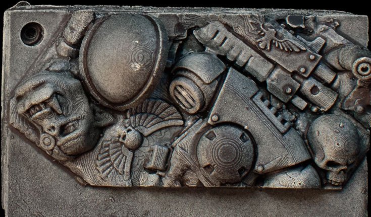

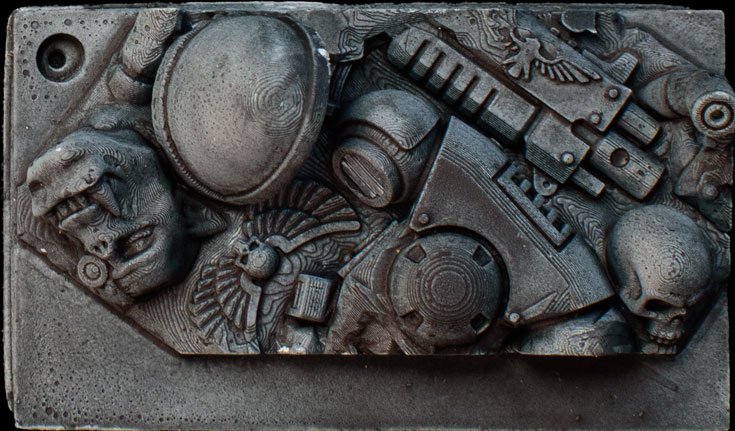
Occultist Cloak
Blackish Blue Grey


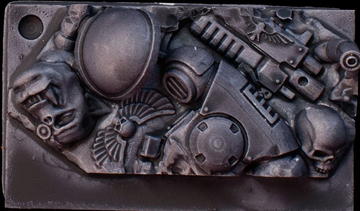
Gravelord Grey
Grey

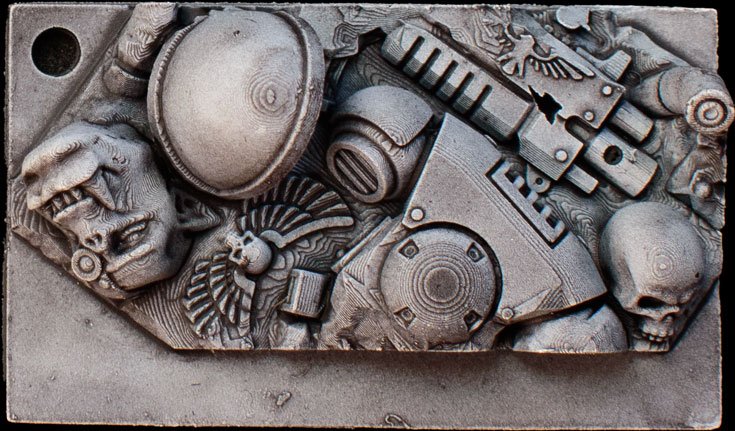
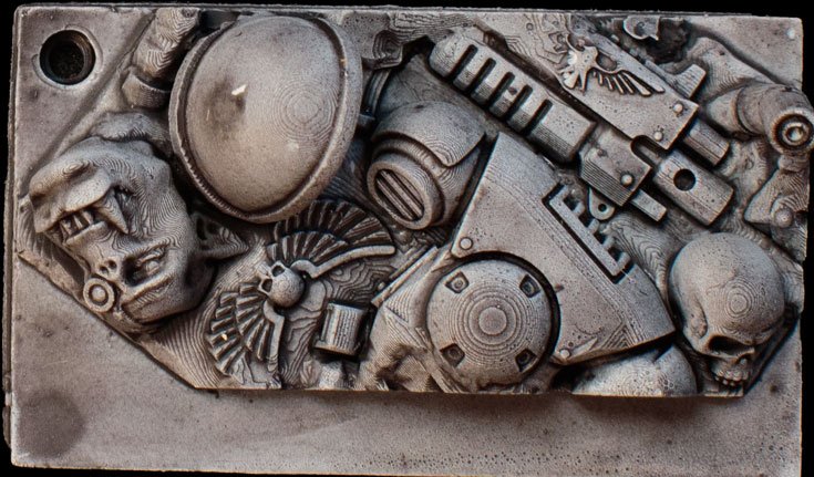
Holy White
Greyish White


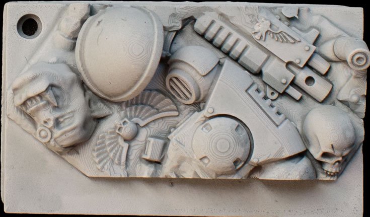
Cloudburst Blue
Dark Blue


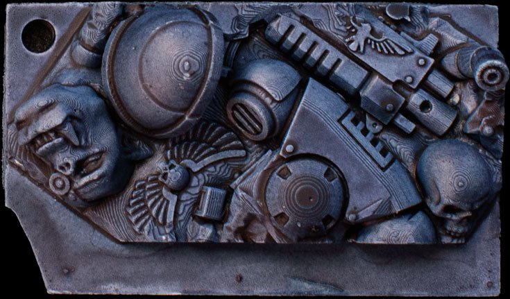
Runic Grey
Bluish Grey

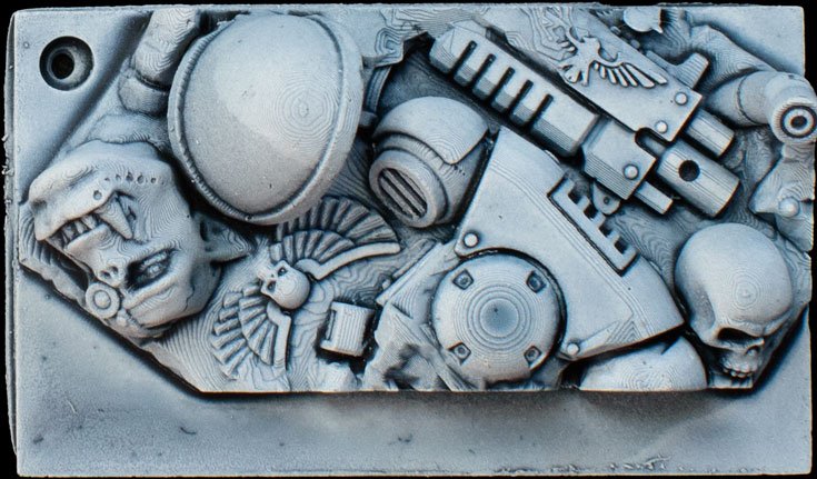
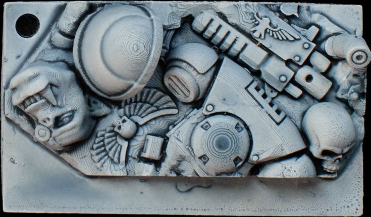
Ashen Stone
Light Grey
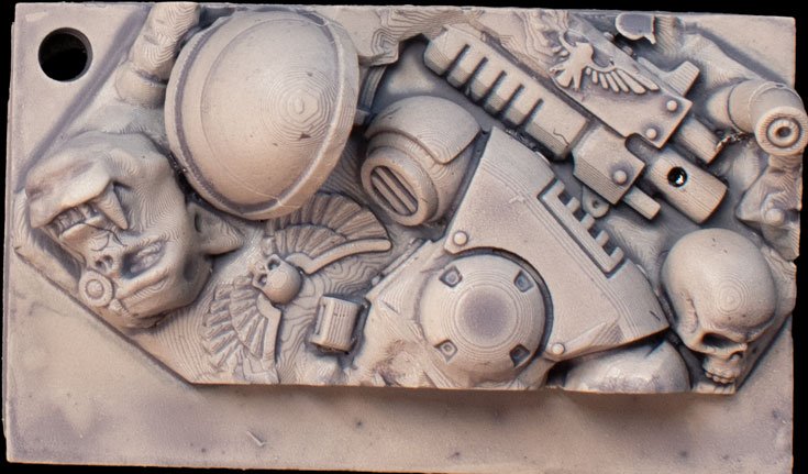
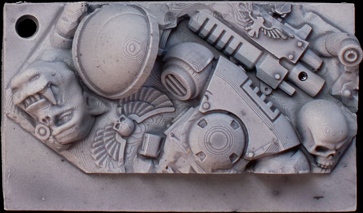
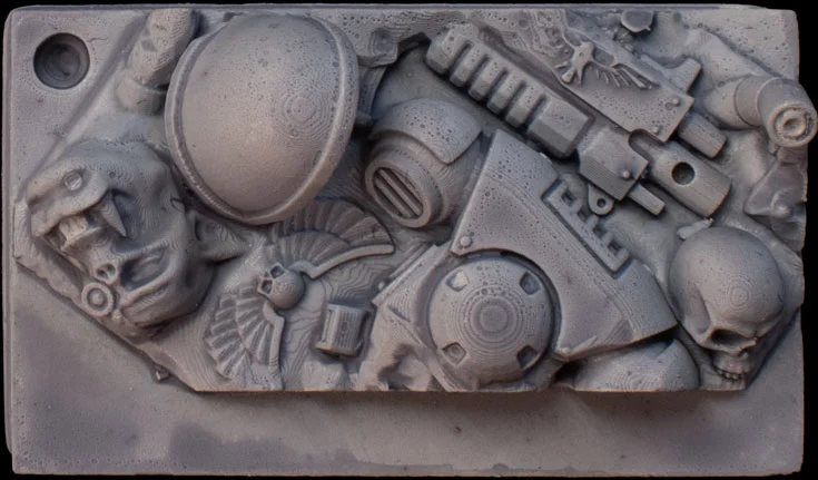
Battleship Grey
Light Bluish Grey


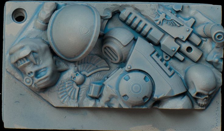
Dusk Red
Pale Purplish Red
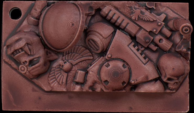

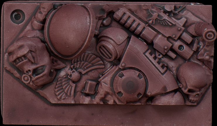
Satchel Brown
Dark Reddish Brown
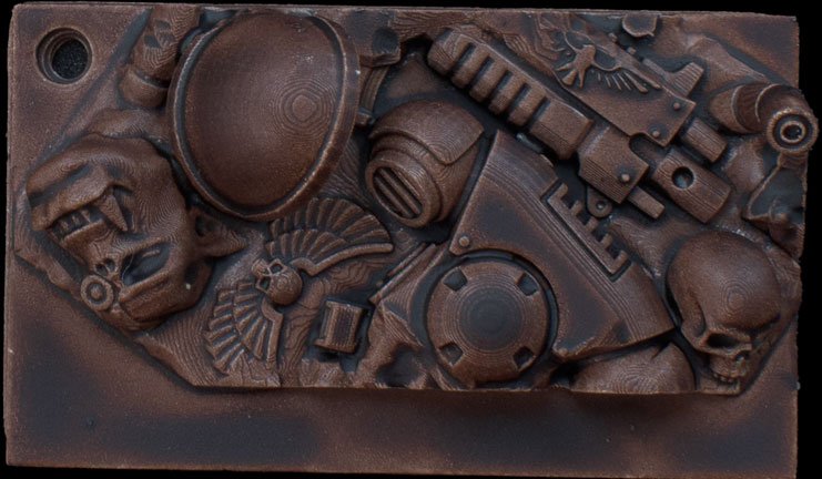
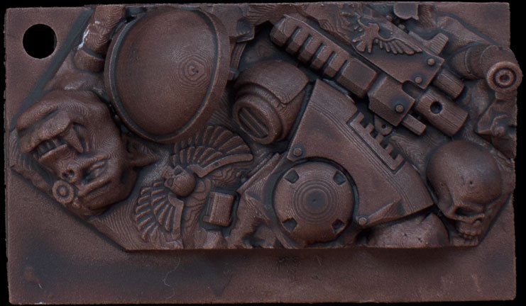

Dark Wood
Deep Brown
Rudy Fur
Deep Reddish Brown
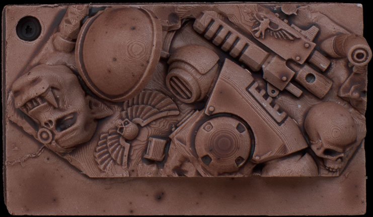
Hardened Leather
Light Brown


Noble Skin
Dark Brown


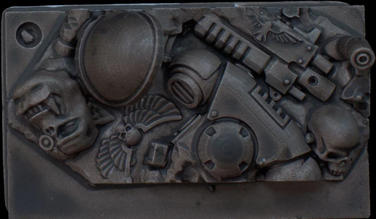
Goddess Glow
Light Purplish Red


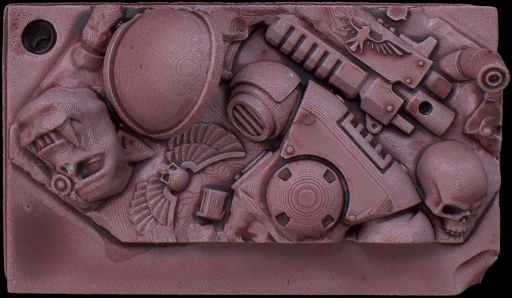
Warrior Skin
Light Reddish Brown


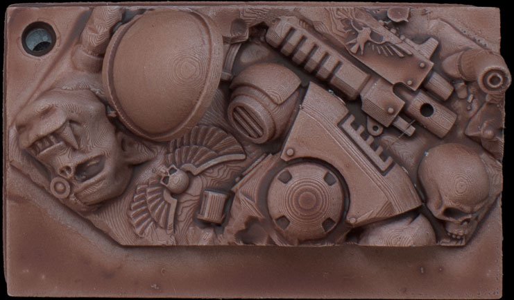
Murder Scene
Black Purplish Red


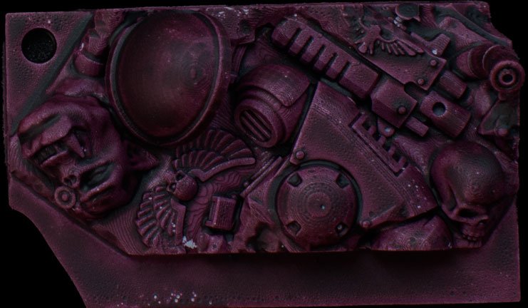
Slaughter Red
Deep Red
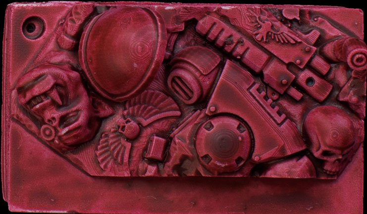
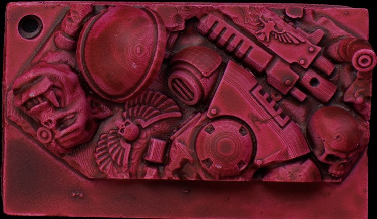

Blood Red
Strong Red
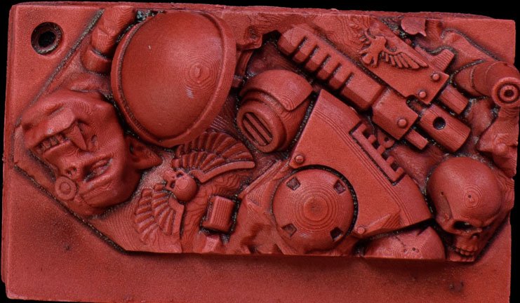
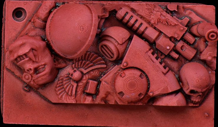
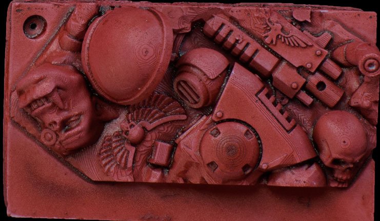
Poppy Red
Brilliant Red
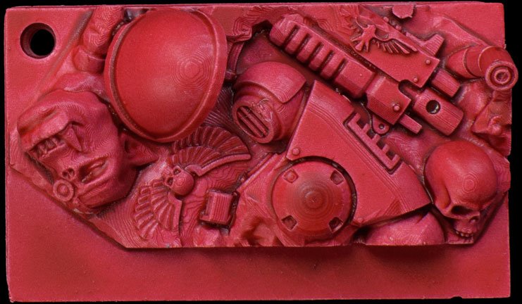
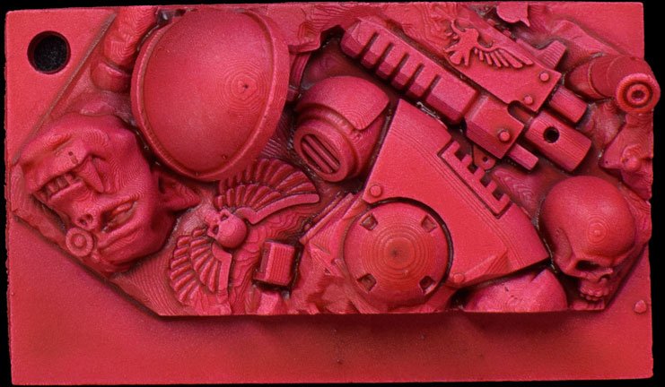
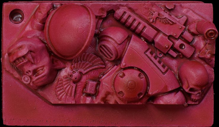
Bright Red
Reddish Orange

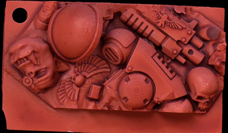
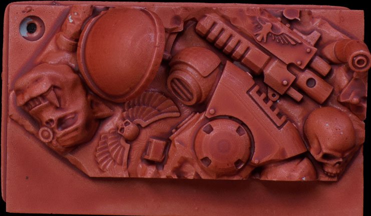
Maize Yellow
Vivid Yellow


Ancient Honey
Yellow
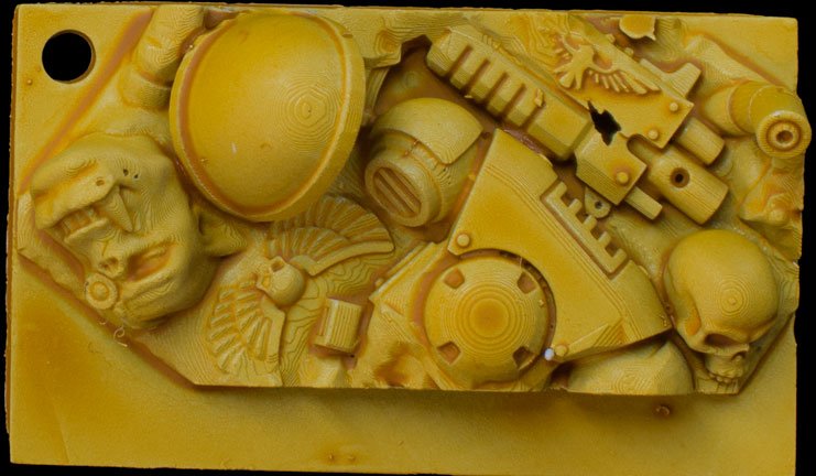
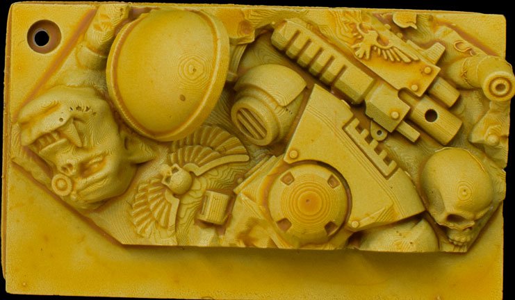

Zealot Yellow
Orange Yellow
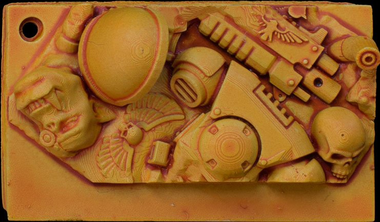
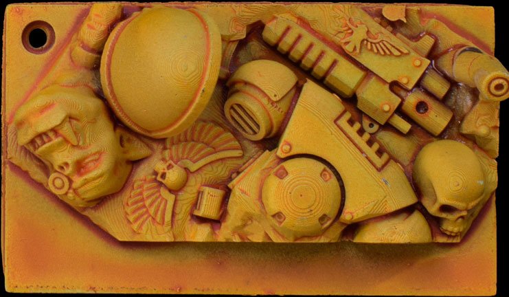

Sand Golem
Strong Yellowish Brown
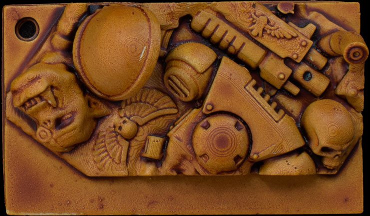

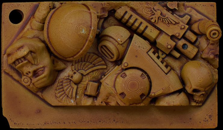
Nuclear Sunrise
Vivid Orange


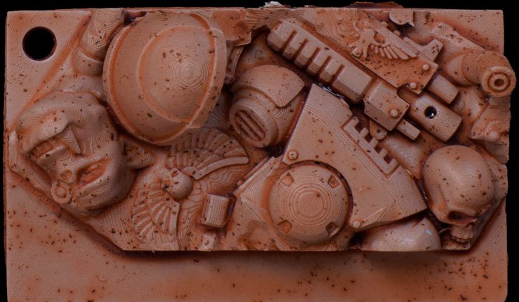
Fire Giant Orange
Light Orange
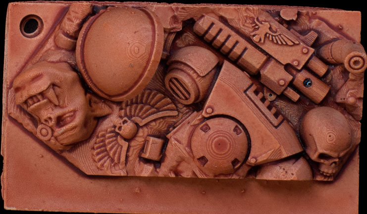
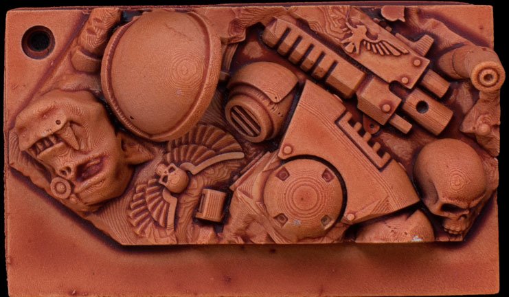

Aged Hide
Pale Yellowish Pink
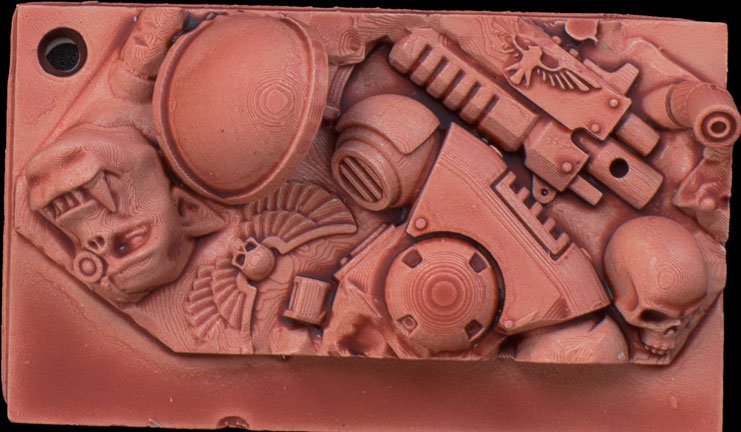
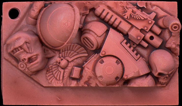
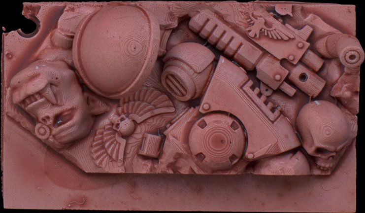
Peachy Flesh
Light Yellowish Pink


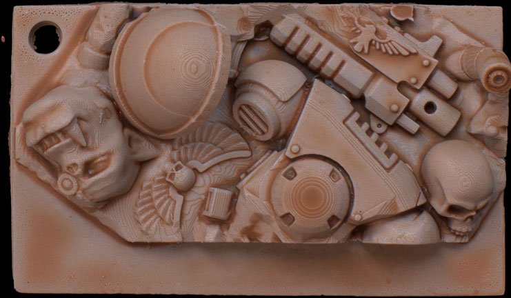
Crusader Skin
Pale Reddish Brown
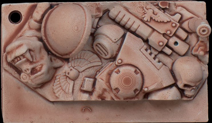
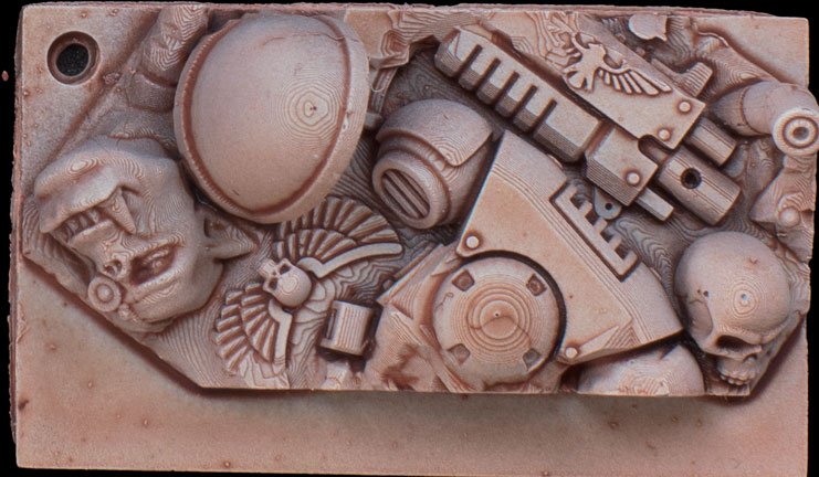

Fire Drake
Brownish Orange


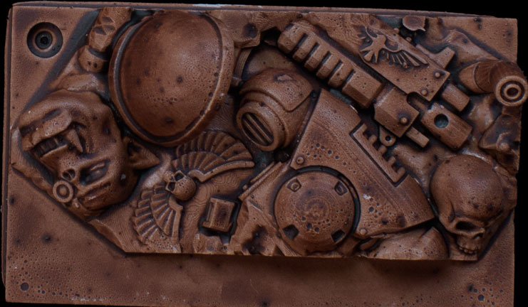
Bony Matter
Pale Brown
Pallid Bone
Pale Yellowish Brown
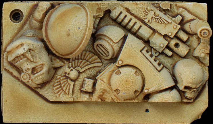

Burnt Moss
Blackish Green Grey


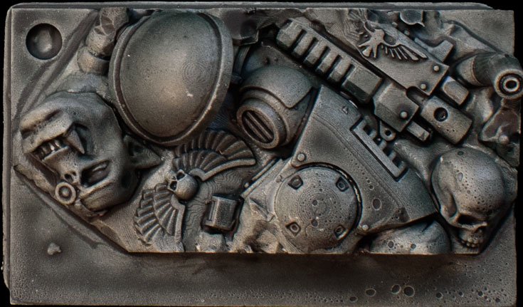
Gunner Camo
Dark Greyish Green
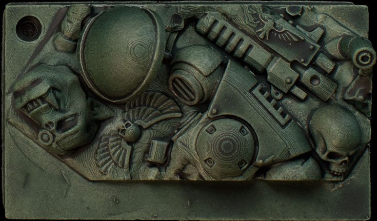
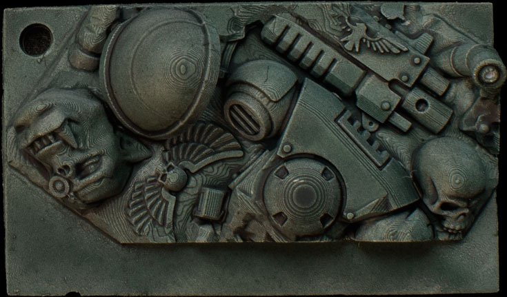
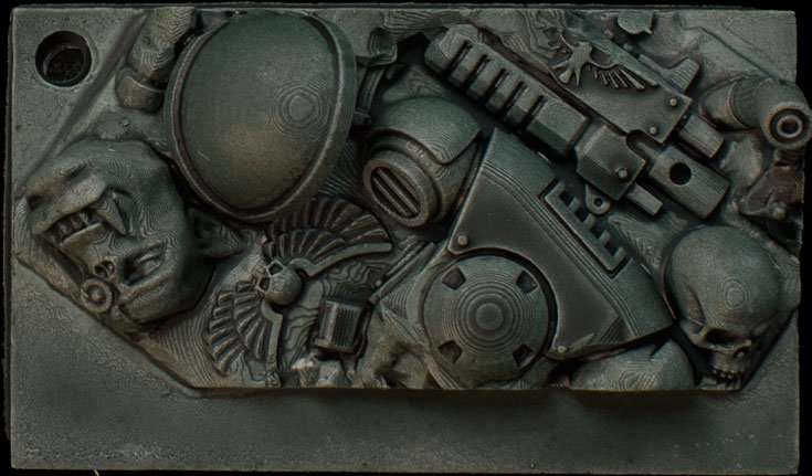
Absolution Green
Absolution Green


Orc Skin
Strong Green
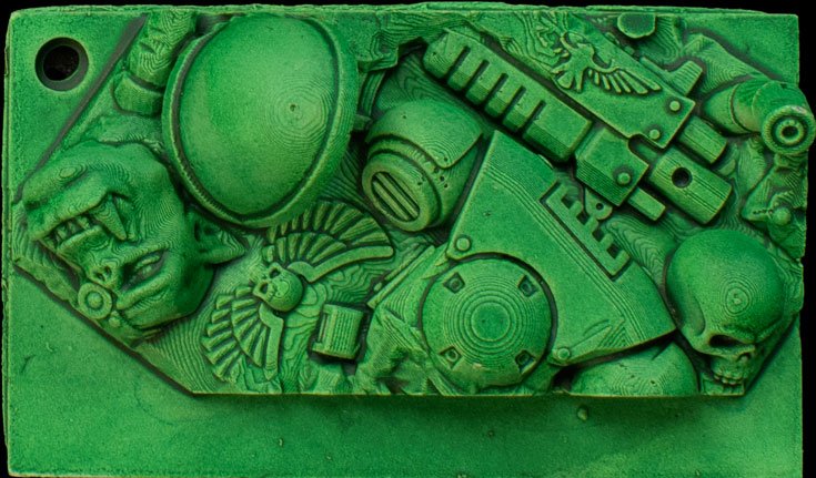
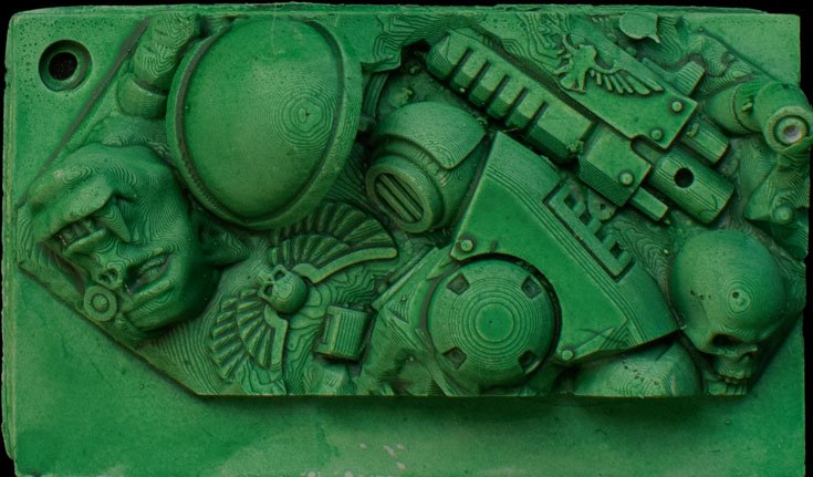
Camo Cloak
Greyish Green
Shamrock Green
Vivid Green
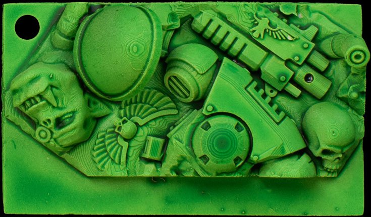
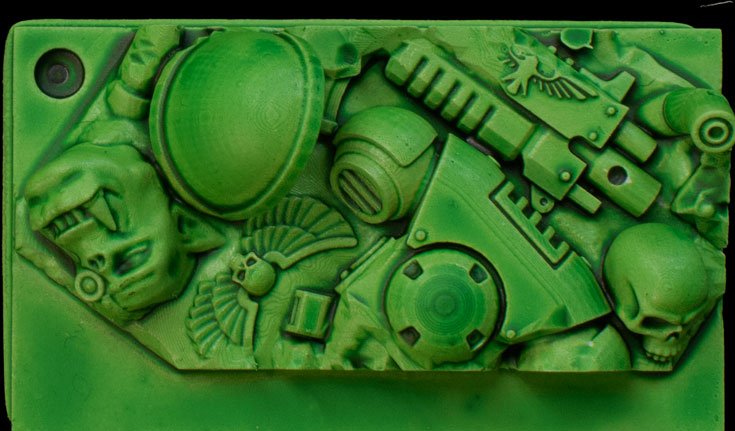
Ghoul Green
Brilliant Green
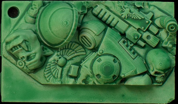
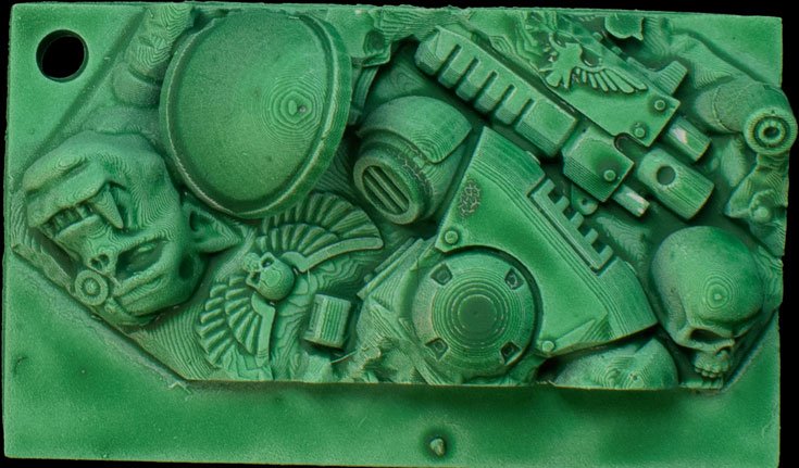

Forest Sprite
Yellowish Green

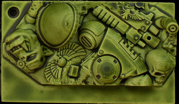

Brownish Decay
Strong Yellowish Green


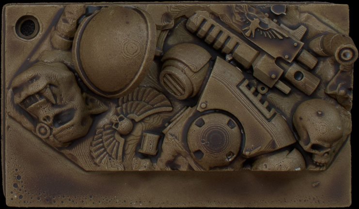
Desolate Brown
Olive


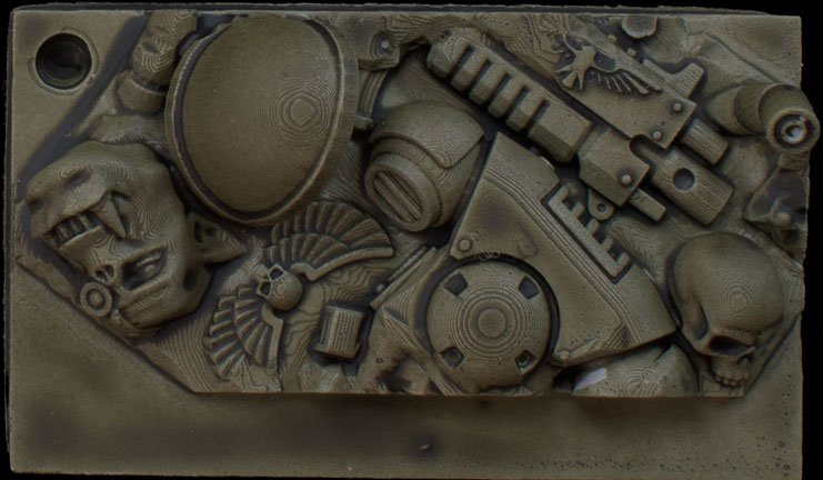
Algae Green
Light Olive Green
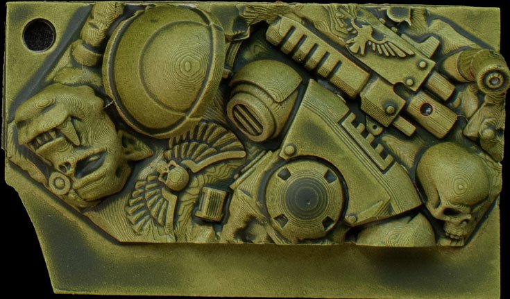
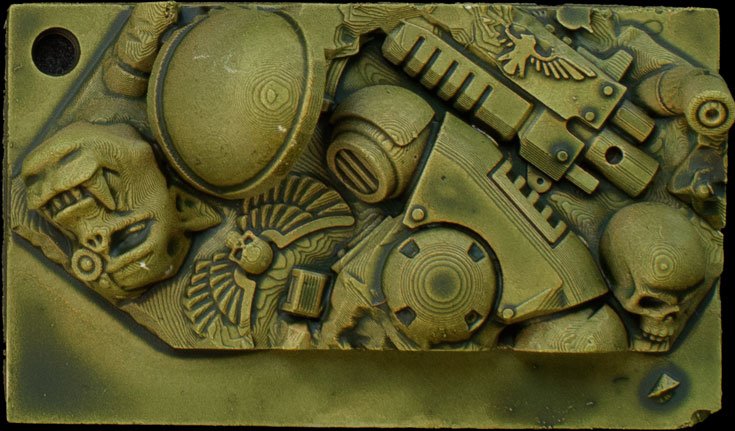

Ghillie Dew
Brilliant Yellowish Green
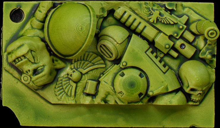
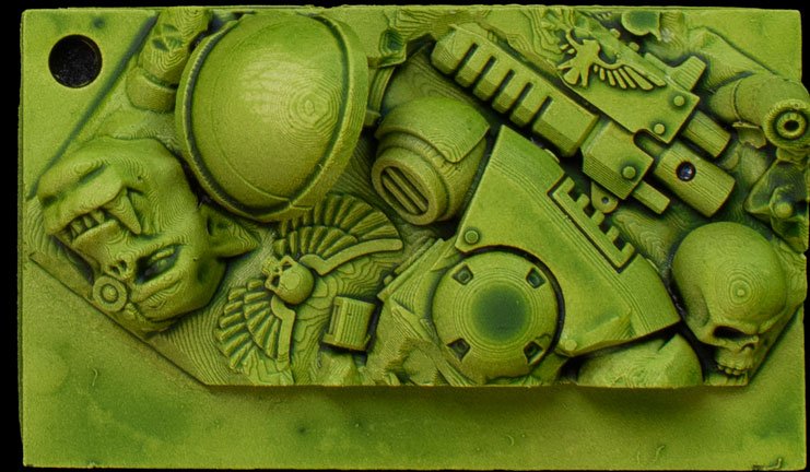
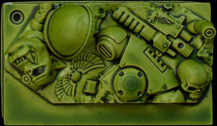
Charming Chartreuse
Greenish Yellow
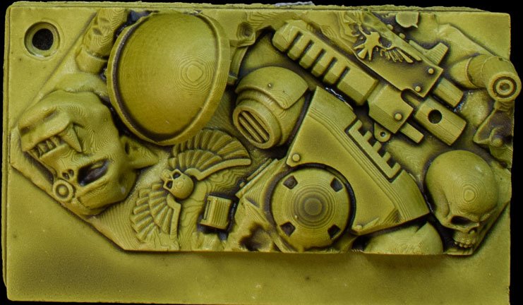

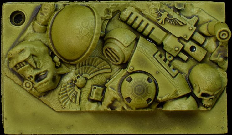
Malignant Green
Light Greenish Yellow


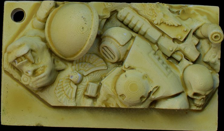
Ochre Clay
Strong Greenish Yellow
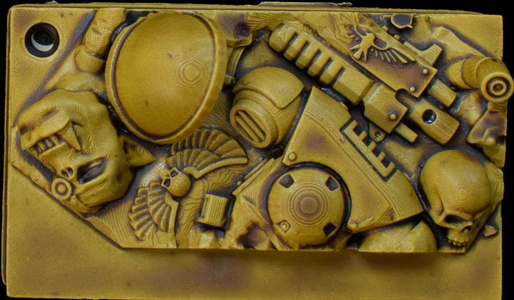

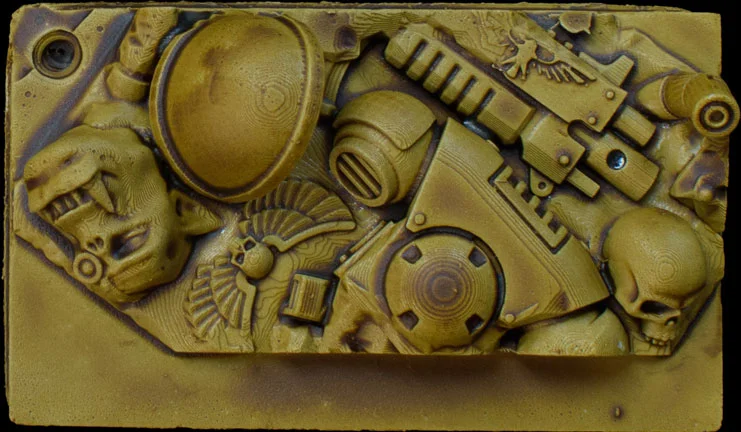
Blackish Blue
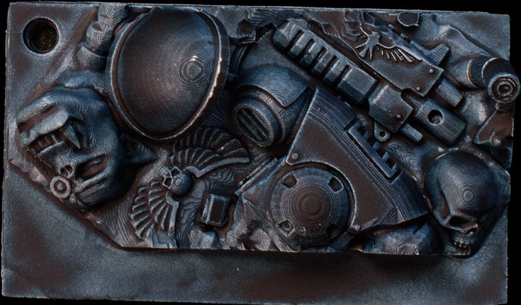
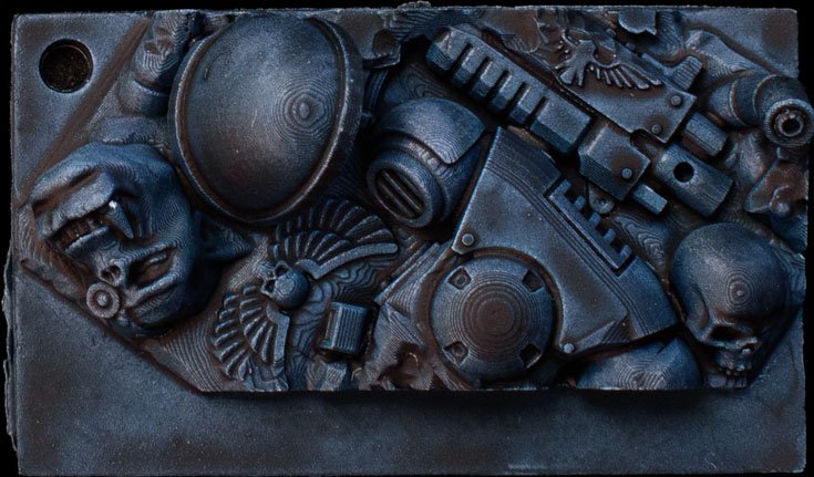

Beowulf Blue
Dark Purplish Blue


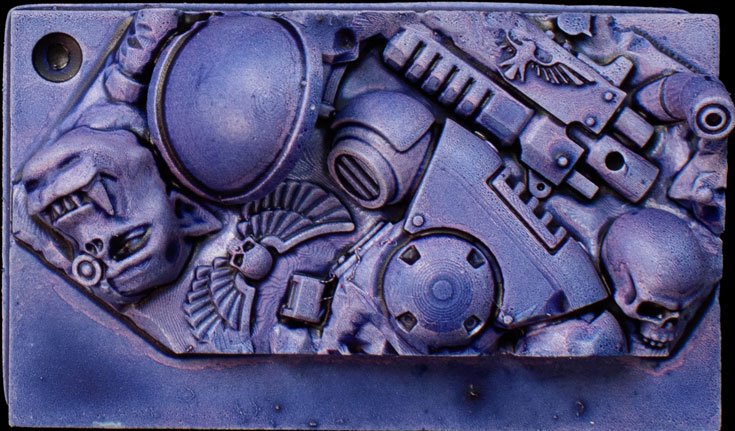
Highlord Blue
Deep Blue
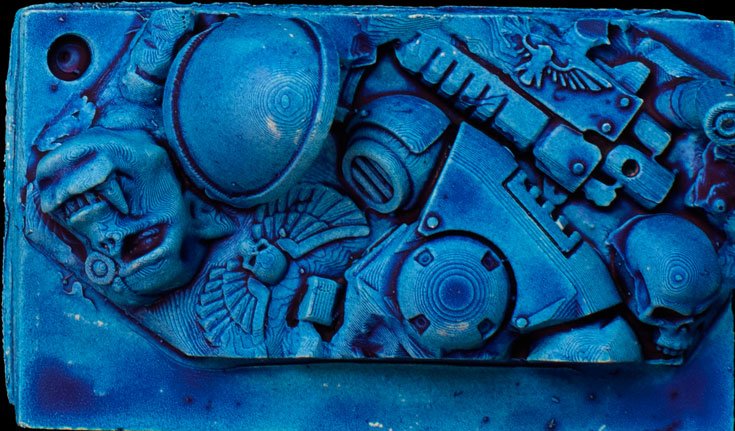
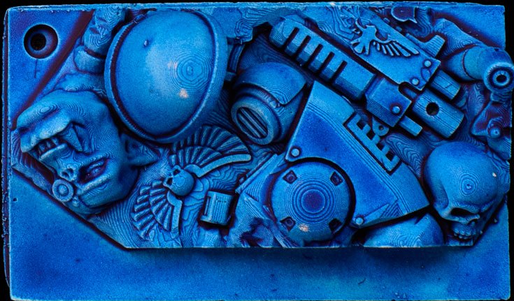

Plasmatic Bolt
Vivid Bluish Green

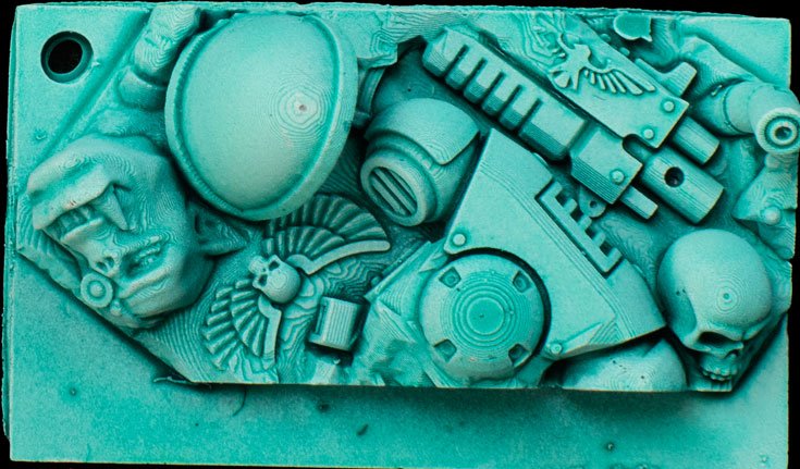
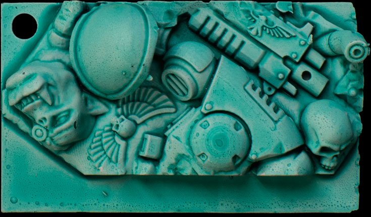
Raging Sea
Deep Greenish Blue
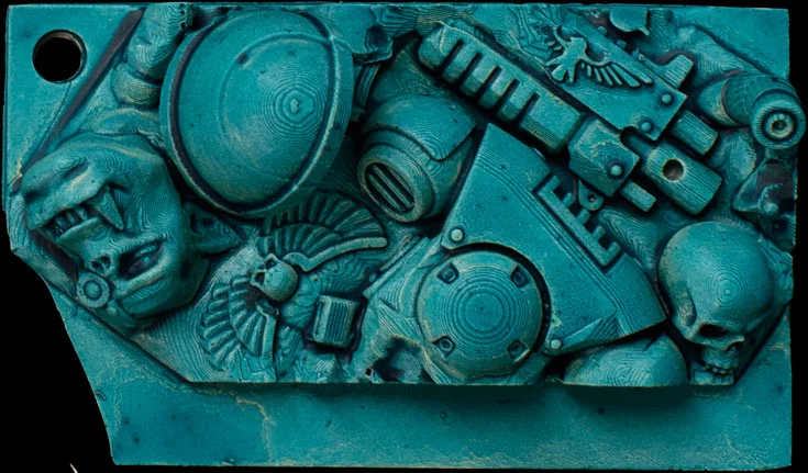
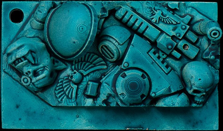
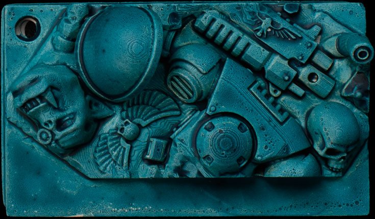
Caribbean Ocean
Brilliant Greenish Blue


Magic Blue
Vivid Blue

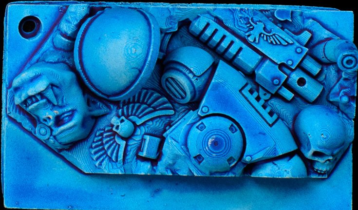
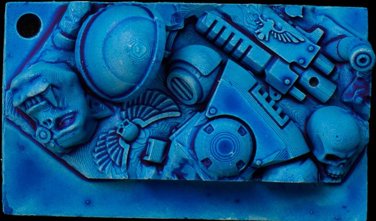
Light Blue

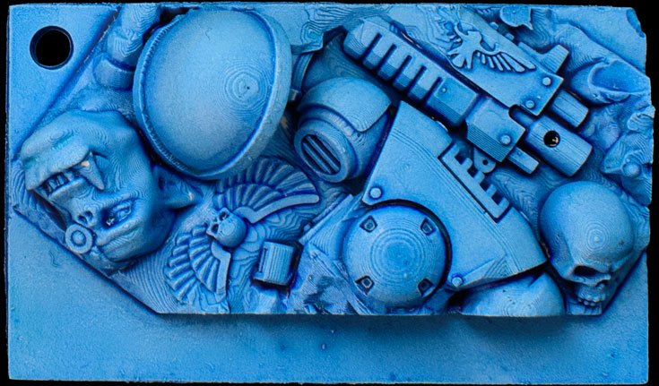
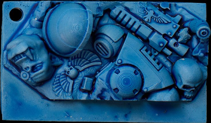
Royal Robes
Brilliant Blue
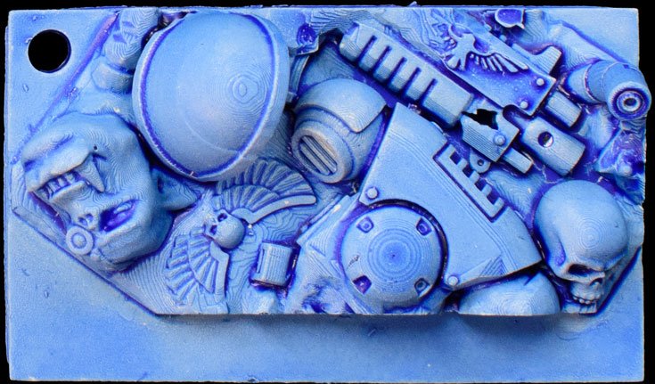
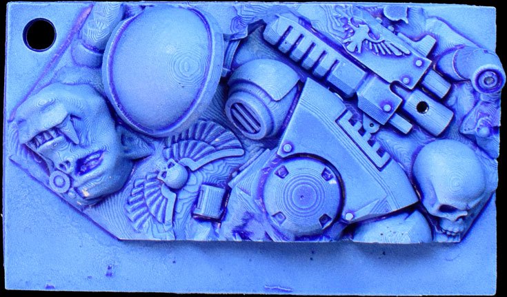

Periwinkle Purple
Purplish Blue


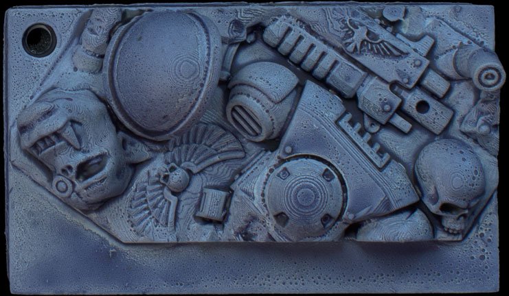
Purple Swarm
Vivid Purple
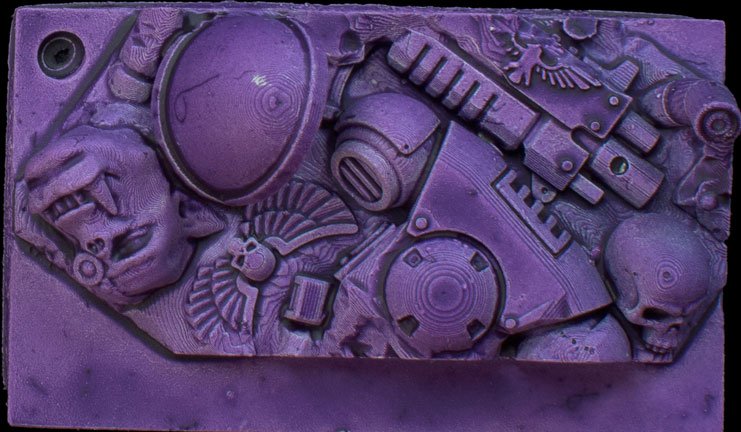

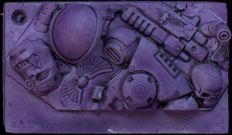
Hive Dweller Purple
Very Dark Purple
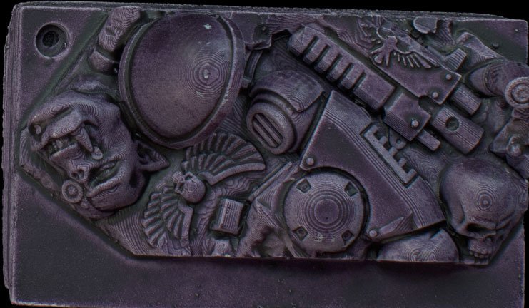

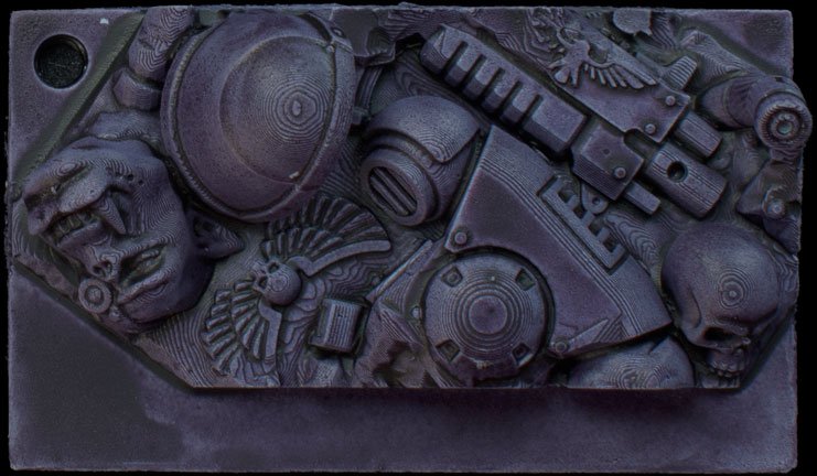
Moody Mauve
Strong Purple
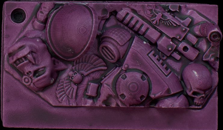
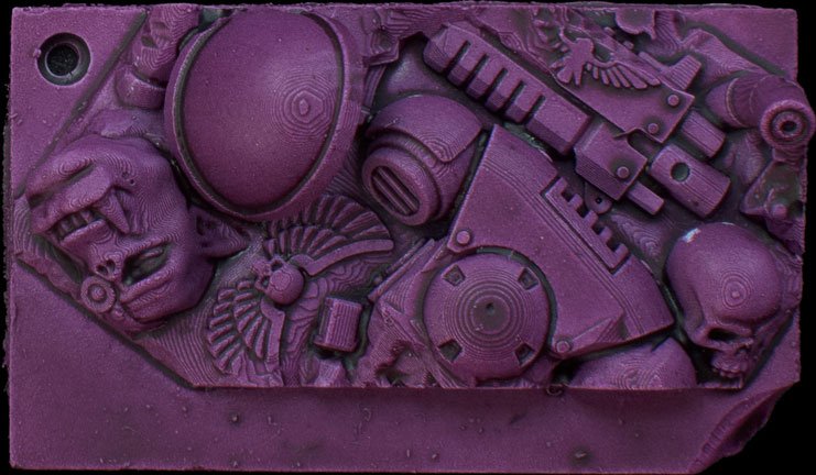
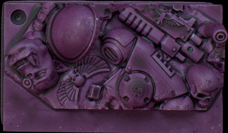
Moonlake Coral
Strong Reddish Purple

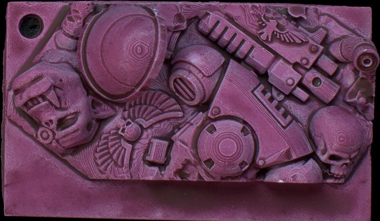
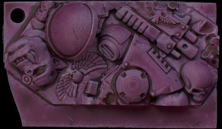
Purple Alchemy
Strong Pink
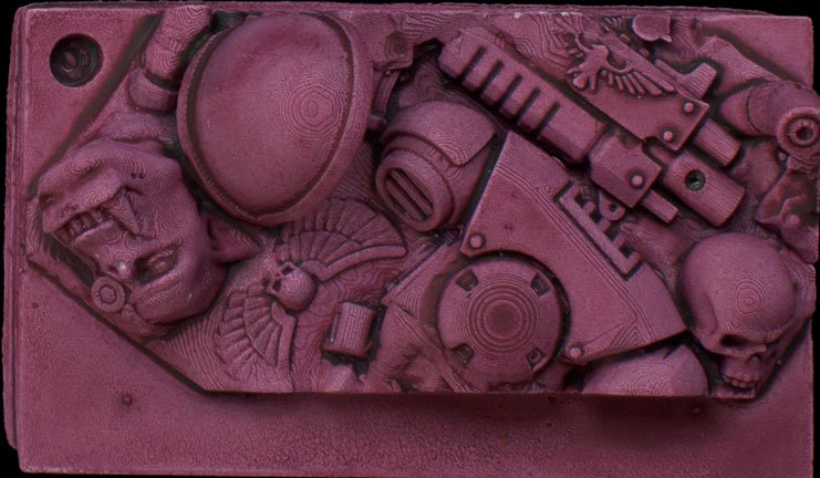
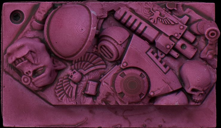
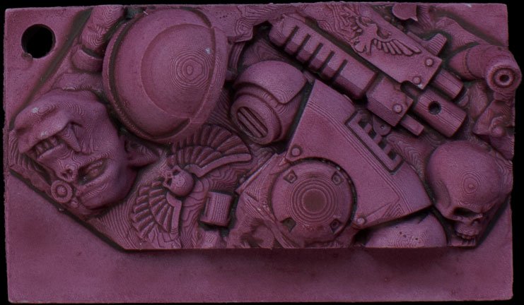
Familiar Pink
Vivid Pink
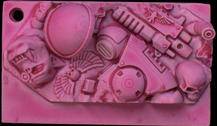
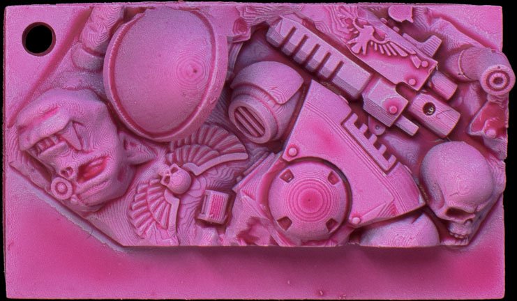

Carmine Dragon
Brilliant Pinkish Red

Hoplite Gold


Talos Bronze


Broadsword Silver
