When I first got involved in the hobby of painting fantasy miniatures —coming from an acrylic painting background,— there were a number of practices that it seemed were commonly understood in the art world, but were not that common in the miniature modelling community.
The concept of colour theory in miniature painting was very much absent or at least the basic grasp of it was misunderstood.
In part, I’ve realised this is because the vast majority of people starting out with their Warhammer armies, and getting into painting them, are aiming to be players and strategists —not acrylic artists.
Therefore, it makes perfect sense that some core principles such as wet blending and glazing were not common, yet others such as dry brushing and washing were in use.
After all, if you need to paint loads of miniatures you need to find methods for doing it quickly
In this article, I will go over the basics of colour and the aspect of it is that is relevant to miniature painting.
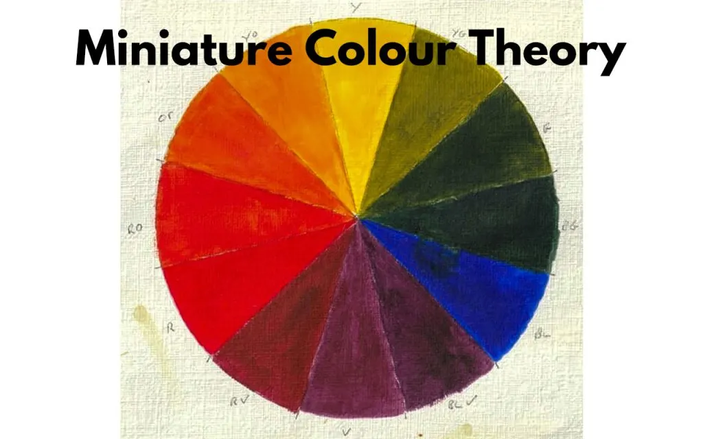
Colour theory in miniature painting
One element that was notably missing in the miniature hobby world was the application of Colour Theory and, to assist in the use of this —in terms of choosing and creating a painting scheme or palette— was the use of a Colour Wheel.
When we look at why this might be, it seems the most likely explanation is, as we’ve discussed, most people aren’t trying to be artists per se; they’re trying to paint their armies and get them into battle.
To my mind, this is further reinforced by the massive range of paints that are available from the likes of Games Workshop and Vallejo, amongst others.
I’d been used to shopping for tubes of Winsor & Newton or Grumbacher and mainly buying the primary colours, along with a tube of black and white, then mixing to get the colour I needed.
So, you can imagine the OMG moment I had walking into my local Warhammer store and seeing the massive paint range available!
Knowledge of Colour theory can make you a better painter
Having such a large range makes sense when you consider that most of the community just want to buy a set of colours that match a given colour scheme, get painting, and get playing.
However, or should I say ‘but’ (because you knew the but was coming…), most of the paints we know as layer, base, and dry —in the Games Workshop range, for example— can be mixed at home by yourself if you know Colour Theory.
Sure, it’s a bit more work than just buying them and will take practice to mix your own.
But (yes, another one…), if you know ‘why’ Flash Gitz Yellow layer paint, Jokaero Orange base paint, or Slaanesh Grey dry paint can be created from the primary colours plus some black or white, then you can learn ‘how’ to make them and gain the ability to mix over 170 different colours from five.
You read that right:
Five colours to make hundreds you might normally buy; that’s the power of Colour Theory!
A Quick Background on Colour Theory and the Colour Wheel
Colour Theory is just that, a theory; a set of ideas that provides guidance on what we understand about colour, its different aspects, and why certain colours work together when used in anything from print, painting, and home décor to miniature models and dioramas.
Famous people such as Aristotle, Leonardo Da Vinci and Newton, amongst others, have all put forward theories on colour.
However, it was the German artist Jakob Christoff Le Blon who, in the 1720’s, wrote about the importance of Red, Yellow and Blue to derive all colours when using pigment —that’s the stuff we have in our paints.
Here’s an interesting thing:
Pigment in paint, mixed together more and more, results in black, as opposed to colours of light that, when mixed together more and more, end up as white.
Whoa!
That was a huge realisation by Le Blon;
Light is ‘additive’ as, when we add more, we get white, whereas pigment is ‘subtractive’ as, when we add more, we get black (eat that, Newton!).
So what about that colour wheel?
It was Newton, however, who arranged the colours he’d identified from splitting white light through a prism into a Colour Wheel.
It’s from that wheel that all Colour Wheels have been based since —back at you, Le Blon!
If you’ve followed along to this point, you’ll have realised that Newton was arranging the additive colours of light into his colour wheel, whereas we’re concerned with the subtractive colours of pigments in paint.
Let’s discuss a little about pigments, as understanding what they are will be critical in understanding the ‘how’ of how to mix paints and get the colours we want.
A few notes on Pigments in paint
That range of over 170 paints we mentioned above varies mainly because of the pigments used.
There’s also water and acrylic binder, but that’s a topic for another time.
Different pigments, even of the same colour, are, for example, why there are so many blues.
Just in the Games Workshop Dry range, we have seven blue paints, namely: Stormfang, Chronus Blue, Etherium Blue, Thunderhawk Blue, Skink Blue, Hoeth Blue, and Imrik Blue.
However, while having this set of blues to hand makes life easier, we shouldn’t need to buy all of them.
By applying Colour Theory, we should be able to mix a colour that mimics these sufficiently closely to be good enough.
This also applies to Base and Layer colours.
If we have a pot of Kantor Blue Base paint, we should be able to get out our pots of Red, (Kantor) Blue, Yellow, White, and Black paints and mix a close approximation of Caledor Sky or Thousand Sons Blue.
So, now we can see there’s a practical reason as to why we’d want to know Colour Theory, but it’s not the only reason.
Let’s move on to understand, in more detail, what Colour Theory is, its additional benefits when painting miniatures and how we use it with a Colour Wheel.
Then, get hands on and mix some colours up to demonstrate what we’ve learned!
Colour Theory explained in detail
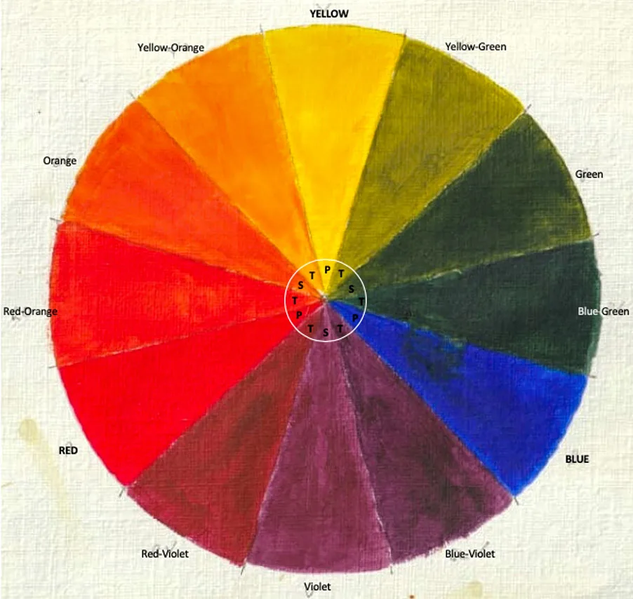
Primary, Secondary and Tertiary Colours on the Colour Wheel
In order to discuss choosing and mixing colours effectively and consistently, we need to be clear on the vocabulary and concepts of Colour Theory.
By mixing the Primary colours in different ways, we’re able to get twelve colours with ease.
Let’s see how:
Primary Colours
As you’ll likely already know, the 3 primary pigment colours —also called hues—
- Red
- Yellow
- Blue.
These pure colours can only be manufactured and not made by mixing other colours.
Secondary Colours
By mixing any two primary colours, we get the 3 secondary colours
- Orange
- Green
- Violet
Red and Yellow make Orange, Yellow and Blue make Green, and Blue and Red make Violet
Tertiary Colours
Also known as an ‘intermediary’ colour, they are made by mixing equal amounts of a Primary colour with a Secondary colour next to it on the Colour Wheel.
This results in 6 Tertiary colours of:
- Red-Orange
- Yellow-Orange
- Yellow-Green
- Blue-Green
- Blue-Violet
- Red-Violet
What is Complementary Colours?
Another key element of Colour Theory to be aware of are the Complementary Colours.
These are colours placed directly opposite to each other on the Colour Wheel.
Complementary pairs always consist of a primary with a secondary, such as red and green or blue and orange, or two tertiary colours such as red-orange or yellow-green.
What is Colour Intensity?
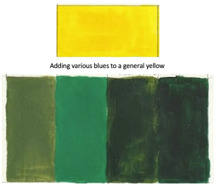
Bright or Dull green made by adding different blues to the same yellow
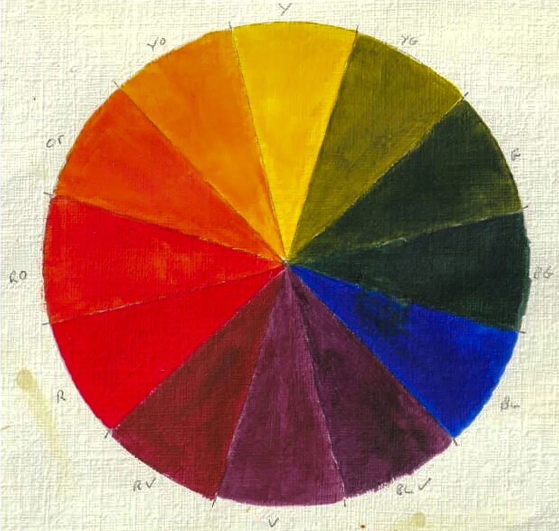
What will strike you from the above Colour Wheel is that we get one type of blue, not the seven blues in the Games Workshop Dry range we discussed earlier.
The purity of the primary colours used to create secondary and tertiary mixes affects the relative Chroma (also referred to as Saturation or Intensity,) of the secondary and tertiary colours we end up with.
If we choose Kantor Blue or Caledor Sky Base colours as our primary blue, we’ll end up with a secondary and tertiary of differing intensity.
Colour intensity determines the relative brightness or dullness of the colour we achieve from our mixing of the primary and secondary colours.
What is Colour Bias?
Similar colours also have what’s known as a Bias; this is a result of the different pigments the paint contains.
Every version of a primary colour that you choose has a bias, which means it encroaches on the next primary colour in the Colour Wheel.
If we look back at the blue Layer colours, we can readily see that Calgar Blue must have a red bias and Templar Guard Blue has a yellow bias —most likely.
We’d need to get some paint on a pallet and mix a secondary of the blue with some red and yellow to see if they became more intense or muted.
Below we can see yellow with a red bias making it look orange and a blue that looks like it has a yellow bias making it look slightly green compared to others.

Similar colours with obvious colour bias towards a second primary
Just for clarity, you may also have heard of Colour Shift; this isn’t the same as Colour Bias.
Paint is made up of Acrylic Resin, Binder, and Pigment.
The Resin is generally white, meaning that, as the paint dries, it darkens.
This Colour Shift means the tint changes and explains why techniques such as layering and underpainting can be useful.
Tint, Shade and Tone explained
Remember we mentioned that, in addition to the primary colours red, yellow and blue, we would also need to use Black and White.
It’s the addition of black or white to a primary, secondary, or tertiary that will create a Tint or Shade of that colour.
Tint – A tint of a particular colour is one that has been mixed with increasing amounts of white.
Tints can go from the pure colour that will be at its maximum intensity, through to white.
Shade – A shade of a colour is one that has been darkened with increasing amounts of black or with a second colour, typically its complementary colour.
Possible shades go from the pure colour through to black.
Tone – The tone of a colour is a measure of that colour’s relative lightness or darkness when mixed and can be used to describe both a tint and a shade.
Tone is generally split across a range of light, mid and dark tones.
As you can imagine, when trying to decide what tint, shade or tone of a given colour is being used in a colour pallet used on a miniature, having them presented on a Colour Wheel will be invaluable in mixing them yourself.
In addition to simply adding black or white to adjust a tint or shade, we can also mix varying amounts of black and white to get a grey, that we can, in turn, mix into our colours, to change the tone of the colour.
Yellow tints and shades created by adding increasing amounts of white and black
What is Intensifying Pairs?
Complementary colours are also known as Intensifying Pairs because, when they are placed side by side, they appear to intensify one another.
This effect is referred to as Simultaneous Contrast and is due to the way vision works with colour and an effect known as Afterimaging. The eye wants to have a complementary of the colour it sees.
This is the reason why it is wise to pick a colour scheme for your army or miniatures according to complementary colours on the colour wheel. The eyes of people will just like it better!
There’s a scientific reason this happens:
Due to the eye suffering ‘cone fatigue’, but the importance for us is on how colour is perceived when painting our miniatures and dioramas, the way we choose our pallet of colour, and the effect it has on those viewing our work.
For example, stare at a red square for a minute or so, then at a white square; you will see an afterimage of green.
These afterimaging and cone fatigue effects are why surgeon’s gowns are green!
Examples of intensifying pairs
What is Colour Temperature?
All colours are described as being Warm or Cool, which is referred to as their Colour Temperature.
When looking at a Colour Wheel, we can see there is a warm side and a cool side.
The colours through red – orange – yellow are considered warm, whereas the colours through violet – blue – green are considered cool.
Due to colour bias, all colours have warm or cool variants.
For example, even though yellow is warm, Dorn Yellow base colour could be seen as cool compared to, say, Yriel Yellow, which looks warmer as it has a slightly red bias.
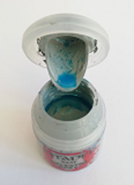
We can sometimes see how this bias is achieved when we leave our paints for a while and the pigment separates from the mix.
For example, Celestra Grey base colour has a blue bias.
Blue pigment separating from the paint mix in a pot of Celestra Grey
What is Neutral Colours?
Complementary colours may be strengthened when placed next to each other, but mixing them together has the effect of subduing the intensity or saturation of that colour.
This is a way of ‘knocking back’ or dulling a colour without using black.
Using black (or white) to darken or lighten a colour should be avoided unless you are trying to achieve a particular tint, shade or tone.
Complementary colours, by the nature of how they are created, contain varying amounts of the three primary colours.
As we now know, colour mixing is a subtractive process: the more of the three primaries we add, the darker the colour will become until it becomes black.
‘However, by carefully adding different amounts of the three primary colours and white, a range of neutral colours can be made.
For example, the secondary colour of green is made from equal amounts of blue and yellow, so to darken it, add more blue and, to lighten it, add more yellow.
Don’t add black and white to achieve a lighter or darker tone as that will neutralise (darken) or washout (lighten) the colour, creating tints and shades.
Always lighten and darken towards the relevant primary.
What this knowledge, you can become much better at making highlights and making great shadows.
Neutral colours achieved by adding more red or more green to each other
How to Understand Your Colour Palette
We’ve learnt a lot about the nature of the paints we have and how we can create a wide range of hues of varying saturation, brightness or dullness, lightness or darkness, tint, shade, tone, etc., and that we can select complementary colours that will combine well and enhance each other when we paint a miniature.
To bring these ideas together, I recommend you take the time to look over your paint collection and split out the primaries, the darkest black, and whitest white you have.
Then, print out a few copies of our downloadable Age of Miniatures Palette Template.
It provides some examples that we put together to demonstrate what’s been discussed in this article and to guide you in its use.
In this way, you’ll know exactly what colours can be achieved with the paints you have!

